Think about the last time a brand stopped you mid-scroll. Maybe it was an ad, a logo, or a product thumbnail. What made you look? Chances are, it was the color. Before your brain had time to read a single word, the color had already said something to you.
That is not a coincidence. It is science.
Studies show that people form a first impression of a brand within just 90 seconds of seeing it, and up to 90% of that snap judgment is based on color alone. Color is not just a design choice; it is a vital business decision that should be at the heart of every creative strategy. Brands that understand this have a significant advantage over those that treat it as an afterthought.
This is where color psychology in marketing comes in. Understanding how colors influence emotions, shape perception, and drive decisions is one of the most underrated tools in a marketer’s toolkit.
In this blog, we will break down what color psychology is, why it matters, how individual colors perform in branding, and how you can use it strategically to build a brand that people not only remember but also trust and buy from.
What is Color Psychology?
Color psychology is the study of how different colors influence human emotions, behavior, and decision-making. It explains how certain colors can create specific feelings and reactions, and how brands use those responses in creative design, communication, and marketing.
A simple way to understand this is that every color communicates a silent message. For example, red often represents urgency, blue builds trust, and green is linked with growth and freshness. These meanings are not random; they are shaped by human psychology, cultural influences, and even natural associations.
It is also important to understand that color psychology is different from color theory. Color theory focuses on how colors work together visually, such as contrast, balance, and complementary shades. Color psychology, on the other hand, is about how colors make people feel and how those emotions influence real decisions. In branding and marketing, this emotional connection is what helps turn visual appeal into action.
Why Color Psychology Matters in Marketing
1. Color Influences Consumer Buying Decisions
Research consistently shows that color influences between 62% and 90% of a consumer’s initial product or brand assessment. That is not a small number. It means that before a potential customer reads your headline, watches your video, or understands your offer, their gut has already responded to your color palette.
2. Consistent Colors Strengthen Brand Recognition
Using consistent color across all your marketing touchpoints can boost brand recognition by up to 80%. Think about how instantly you recognize Coca-Cola’s red, or Tiffany’s robin-egg blue, without even seeing the brand name. That is color memory in action. Consistent use of your chosen palette across your website, social media, ads, and packaging creates a visual shortcut in your audience’s brain.
3. Colors Create Stronger Emotional Connections
People do not buy products. They buy feelings. Color is one of the fastest ways to create an emotional response. Whether you want to feel energetic, trustworthy, luxurious, or caring, the right palette communicates all of that before your audience has processed a single piece of content.
4. Strategic Color Choices Can Improve Conversion Rates
The advertising color psychology behind something as simple as a button color can have a measurable impact on your bottom line and overall conversion rate optimization. In one widely cited study by CXL, red call-to-action buttons outperformed green ones by 21% in click-through rate. The color of your CTA button, your product images, and even your email headers are all working either for you or against you.
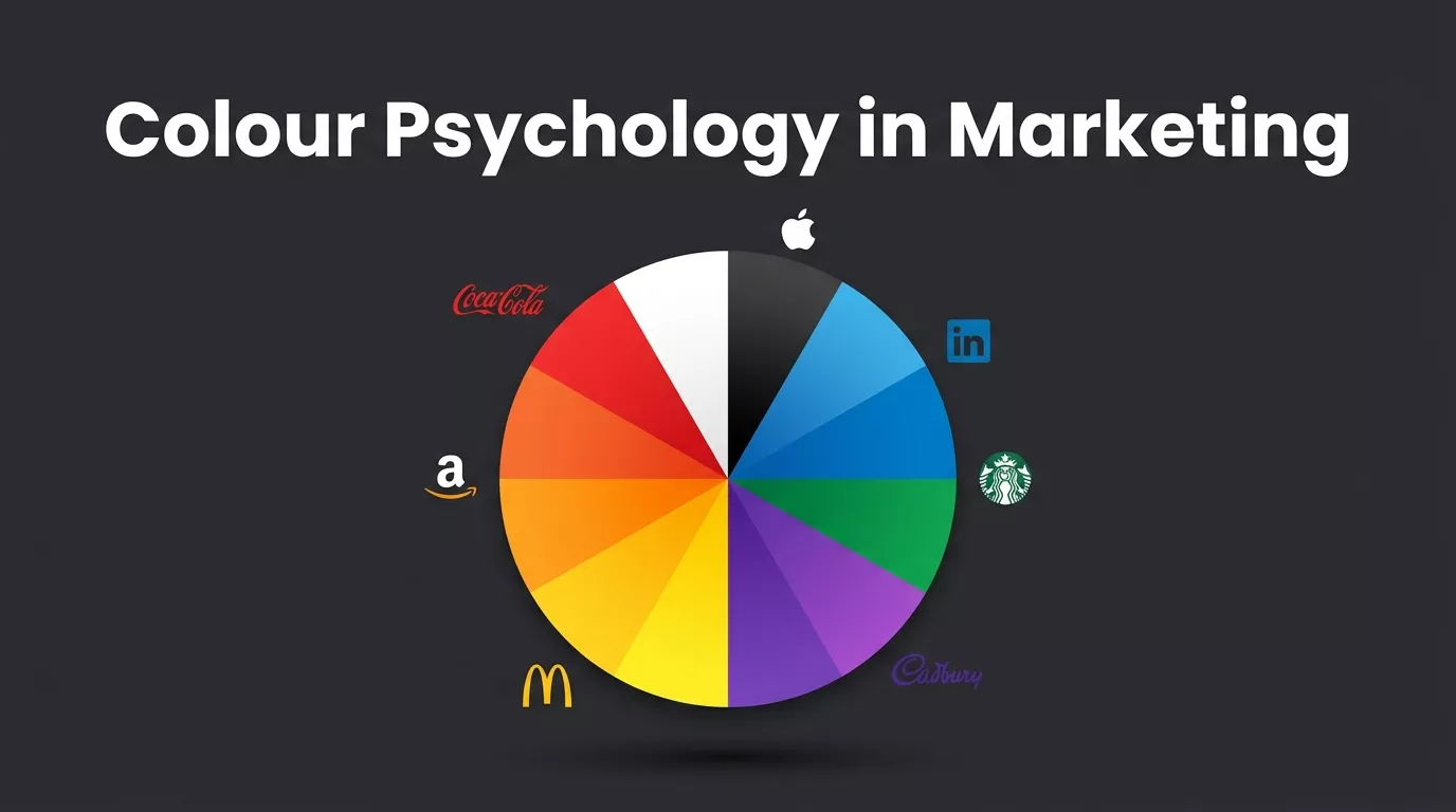
The Psychology of Individual Colors in Branding
Colors play an important role in how people feel about a brand. Each color creates a different emotion, such as trust, energy, warmth, or elegance. While color meanings can sometimes change depending on the situation, there are some common psychological effects that most brands use in marketing.
1. Red: Urgency, Energy, Passion
Red is the color of attention. It raises the pulse, stimulates appetite, and creates a sense of urgency. That is why you will see it everywhere in sales, flash deals, and food brands. Coca-Cola, Netflix, YouTube, and McDonald’s all use red as a core brand element. However, too much red can feel aggressive, particularly for Gen Z audiences who value authenticity over pressure.
2. Blue: Trust, Calm, Reliability
Blue is the most widely used color in B2B branding and is the go-to choice for finance, technology, and healthcare. Why? Because blue communicates trustworthiness and calm competence. LinkedIn, PayPal, Samsung, and Facebook all rely on blue to signal credibility. In color psychology advertising, blue is the universal language of “you can count on us.”
3. Green: Growth, Health, Sustainability
Green has long been associated with nature, health, and growth. But in 2026, the earthy, muted greens are carrying more weight than ever. Brands like Starbucks, Whole Foods, and Land Rover use green to signal quality and environmental responsibility. An important distinction: bright, artificial greens can feel like greenwashing, while deeper, natural tones feel more genuine.
4. Yellow: Optimism, Warmth, Attention
Yellow is cheerful, energetic, and hard to ignore. IKEA, Snapchat, and McDonald’s use yellow to trigger feelings of happiness and approachability. As an accent color, it is incredibly effective. As a dominant palette, it can feel overwhelming. Use it strategically to highlight moments of delight in your customer journey.
5. Black: Luxury, Sophistication, Authority
Black communicates power, elegance, and exclusivity. Apple, Chanel, and Nike use black to signal premium quality. In 2026, dark mode branding is surging, driven partly by OLED screen efficiency and partly because dark palettes have come to feel modern and high-end in digital-first contexts.
6. Purple: Royalty, Creativity, Wisdom
Purple sits at the intersection of passion (red) and calm (blue). It signals luxury, creativity, and a sense of the mystical. Cadbury, Hallmark, and Twitch use it effectively across very different categories. One word of caution: shade precision matters enormously with purple. The wrong tone can accidentally cheapen the perception of your brand.
7. Orange and Pink: Friendliness, Playfulness, Warmth
Orange blends red’s energy with yellow’s warmth, creating a color that feels approachable and enthusiastic. Amazon and Harley-Davidson use it to signal adventure and value. Pink, on the other hand, evokes femininity, romance, and care. Glossier and Barbie have made pink a statement of bold identity. Both colors perform exceptionally well in direct-to-consumer and lifestyle categories.
How Color Psychology Applies Across Marketing Channels
Understanding color psychology in digital marketing is one thing. Knowing how to apply it across different channels is where real ROI is created. Here is how to think about it channel by channel.
1. Logo and visual brand identity
Your logo is the anchor of your visual identity. A useful framework for building your brand palette is the 60-30-10 rule: 60% of your visual space should use a dominant neutral, 30% should carry your primary brand color, and 10% should be a high-contrast accent color used exclusively for calls to action. This structure creates hierarchy, balance, and recognition without visual fatigue.
2. Website and landing page design
In the world of website design and development, color controls the user’s eye movement and decision-making patterns. High-contrast CTA buttons consistently outperform blended ones. Backgrounds affect mood and reading comfort. And in 2026, accessibility standards like WCAG require sufficient contrast ratios to ensure your content is readable for everyone, including those with color vision deficiencies.
3. Social media and paid advertising
In crowded social feeds, warm colors (reds, oranges, yellows) tend to capture attention faster. Cool colors (blues, greens) hold attention longer and generate more engagement time. However, stopping the scroll is only half the battle; cohesive social media branding ensures that once a user pauses, they immediately recognize your brand’s unique identity and professional standards.
4. Email marketing and print collateral
Color consistency across email and offline materials reinforces your brand’s visual identity at every touchpoint. A/B testing background colors, header imagery, and CTA button colors in email campaigns can lift click-through rates meaningfully. The lesson here is simple: color choices in email are not cosmetic. They are strategic.
Real-World Examples of Color Psychology Done Right
One of the easiest ways to understand color psychology in branding is by looking at how successful brands use it. These well-known brands have used colors smartly to build recognition, trust, and emotional connection with their audience.
1. Coca-Cola: Red as a psychological trigger
Coca-Cola has used red as its signature color for over 100 years. Red evokes excitement, passion, and social energy, making it a perfect fit for an impulse-purchase beverage tied to shared moments. Even when a Coca-Cola ad is scrolled past without being read, the red alone reinforces brand memory. That is the power of consistent color psychology branding strategy in action.
2. Apple: White space as a color decision
Apple’s near-total commitment to white and black in its branding is itself a psychological statement. White signals simplicity, purity, and premium engineering. It says, “We have nothing to hide, and we are so confident in our product that the design speaks for itself.” Removing visual clutter is a deliberate act of brand confidence.
3. McDonald’s: The hunger-engineered color combination
Red plus yellow is one of the most neurologically deliberate combinations in all of branding. Red stimulates appetite and signals urgency. Yellow communicates warmth, friendliness, and happiness. Together, they create an emotional shorthand that says: “Come in, feel welcome, eat now.” This is color psychology advertising at its most scientifically intentional.
4. LinkedIn: Blue as the language of professional trust
LinkedIn’s blue is not accidental. For a platform built entirely on professional credibility, relationships, and trust, blue is the obvious anchor. It tells users: this is a serious, reliable place. The same principle applies to financial services, legal firms, and healthcare brands. Trust is the product, and brand color psychology is how you sell it visually.
How to Choose the Right Colors for Your Brand
Choosing brand colors is not about personal taste. It is about strategy. Here is a practical four-step framework that follows a proven color psychology branding strategy.
1. Define Your Brand Personality Before Choosing Colors
Are you a bold disruptor or a trusted authority? Playful or premium? Your personality should drive every color decision. A startup that prides itself on innovation should not be using the same palette as a 100-year-old institution.
2. Research Audience and Industry Color Choices
Look at what colors dominate your industry. Then decide deliberately: do you want to signal trust by aligning with category norms, or differentiate by strategically breaking them? Know your audience’s age group, cultural background, and digital behavior.
3. Create a Consistent Color Palette
Keep it to 2 or 3 primary colors. Use your dominant color for backgrounds and large areas, your brand color for key design elements, and your accent color exclusively for CTAs. More than three colors creates visual confusion and dilutes identity.
4. Test and Refine Colors Based on Real Data
Run A/B tests on your CTA button colors, hero section backgrounds, and email banners. Let conversion data guide your refinements. In 2026, AI-powered tools allow brands to test color variations against real audience segments before committing to a final palette at scale.
Conclusion: Color Is Strategy, Not Decoration
Color is not a finishing touch you add to your brand once everything else is in place. It is one of the first things your audience sees and one of the fastest ways they form a judgment about your business. Used intentionally, color builds trust, triggers emotion, drives recognition, and ultimately converts browsers into buyers.
The brands that get this right do not just look good. They feel right. And that feeling is what turns a one-time buyer into a loyal customer.
Whether you are building a brand from scratch or rethinking an existing one, start with the science. Understand your audience’s psychological responses, research your competitive landscape, and build a color system that is consistent, accessible, and intentionally aligned with your brand’s personality and goals.
If you are ready to build a brand that does not just stand out visually but actually connects and converts, Lantern Digital’s creative and social media branding teams can help you design a color psychology branding strategy that works hard for your business. From palette selection to full brand identity design and digital campaigns, we bring the science of color to every creative decision we make.
Kartik Poduval
Co Founder at Lantern Digital